We have seen some people over the years making the switch from shape based fonts (SHX) to TrueType fonts (TTF) in AutoCAD, BricsCAD, etc.
For the first 12 years of AutoCAD’s existence, you did not have a choice, as SHX fonts were your only option. These are essentially characters defined by vectors. If you zoom in close enough you can see that the letter “O” for example, is composed of 16 line segments (using Simplex.shx). There is nothing curved or smooth about it. But at most plotted sizes, it looks like a perfect “O”, so no worries. Shape based fonts were fast to draw and lightweight.
In 1994, with the release of AutoCAD R13, things changed because TrueType fonts were now supported. Most CAD users were split between DOS (and other O/S) and the graphical Windows where TTF could more easily be used. It took several more years before most users started to seriously consider using TTF due to the slowness with which AutoCAD handled these fonts.
20+ years later, we still see confusion sometimes about the differences between the two font types. Let’s take a look at two important differences.
- SHX fonts honor lineweights
- Whether inherited through their native property or from a plot style, you can effectively control the “weight” or “thickness” of the font characters (hereinafter referred to as the font lineweight) by merely changing the lineweight property, again either directly or via a plot style, just like you can with any other entity such as a polyline or arc.
- So, you can have a single text style (say you name it “Simplex”) and you can draw multiple text objects at a given height (say 0.10″) and have the font lineweight vary between very thin, perhaps to indicate something existing, to very BOLD, perhaps to indicate something proposed. All with one textstyle. You can have as many font lineweights for your text characters as you have lineweights defined in the drawing or plot style. (See image below)
- With TTF fonts, you are limited to two font lineweights (Standard and Bold) for any given text height, and you’ll need a separate text style for each one. TTF font lineweights are scaled relative to the text height. So, want a “thicker” font lineweight? Increase the text height.
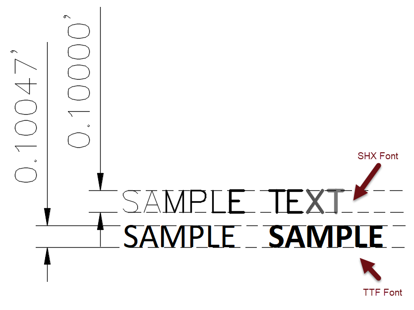
- SHX and TTF characters set to the same height may not be… the same height.
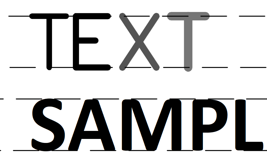
- In the illustration below, The horizontal lines represent the limits of the text height, set at 0.10″
- Note that SHX fonts “grow” in their font lineweight outwardly from the imaginary centerline of the character definition. The “T” on the far right end is now noticeably “taller” due to how the the extra font lineweight is applied (transparency applied so you can see how it rests on the horizontal line)
- Compare that to the TTF (Calibri.ttf) characters on the bottom, that stay contained within their defined height. Note that the font lineweight of the TTF characters never exceeds the defined height, also represented by the horizontal lines.


There’s a pesky bug in how TTF fonts are handled in blocks. If you add a TTF-text in a block, insert the block and put the same text with the same style next to it, you’ll notice the text in the block appears a bit bold-ish, with jagged contours around the edges of the letters. Bug is acknowledged by Autodesk, but still not fixed….
Thanks Simon!
One important difference that would be worth including in a future versions.
.SHX fonts just need to be ‘found’ in the search path, which .TTF fonts typically need to be installed into the Windows OS.
This is a frequent source of confusion that I sometimes get.
Otherwise, another great article.
Thanks Brian! You just included that.